
US Obesity Rate 1990-2015
US Obesity Summary
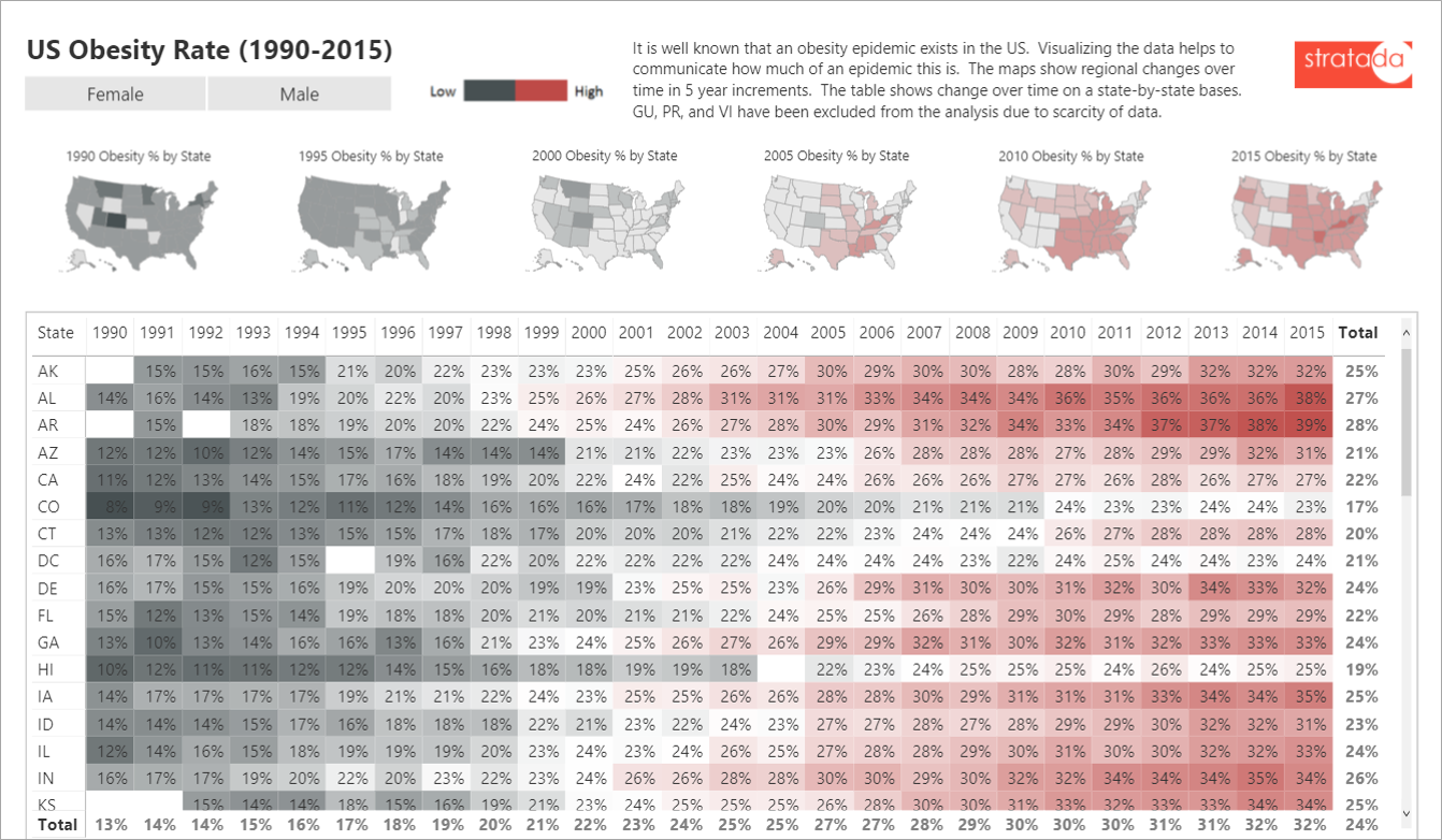
This visual display shows the increase in obesity rates across states in the US. The maps help to visualize regional changes and the table lets you see these changes in greater detail on a state-by-state level. The use of a diverging color scale communicates the changes more clearly.
US Obesity Change
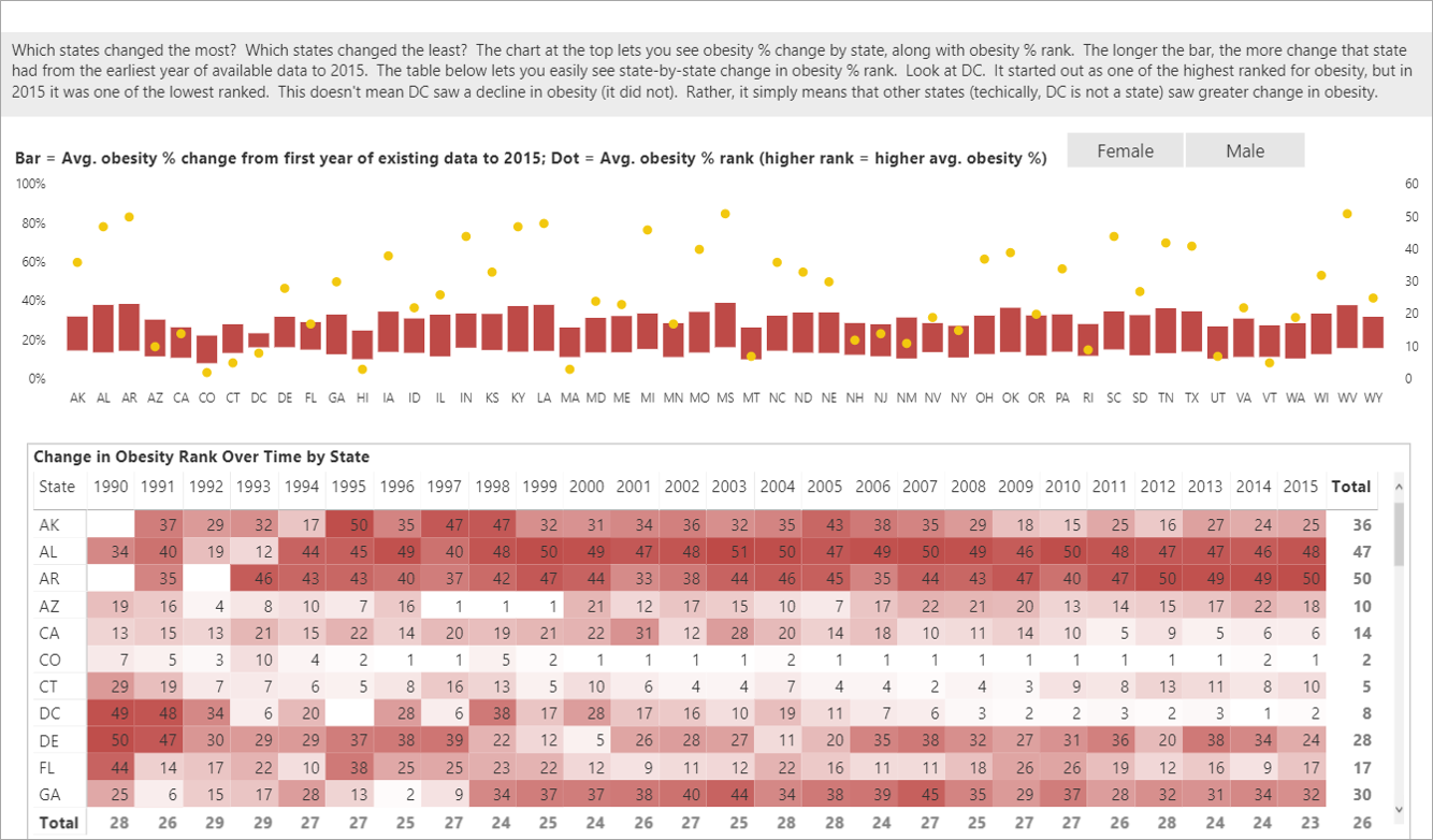
This visual display focuses on obesity ranks by state and how they changed over time. The top visual shows the avg. obesity rate change (length of bar) and the avg. obesity rate rank (dot) by state from 1990-2015. The table shows how states changed in ranking over time. Which ones increased the most?.
US Min/Max Obesity by Year
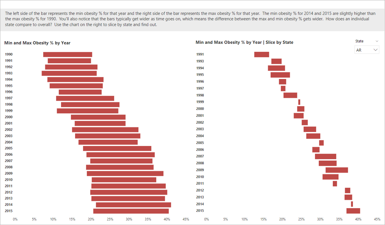
This visual display focuses on obesity rate changes by year. The visual on the left presents overall obesity rate changes by year. The left side of the bar represents the min and the right side of the bar represents the max. The min/max increased over time. The visual on the right slices by state.