Analysts and developers, proficient in R, have been able to incorporate R visuals in their Power BI projects for quite some time now. It made sense that Microsoft started with R implementation in Power BI, as they acquired Revolution Analytics and its implementation of the R language back in 2015. However, Python has been on the rise, even bypassing R in the realm of data science.
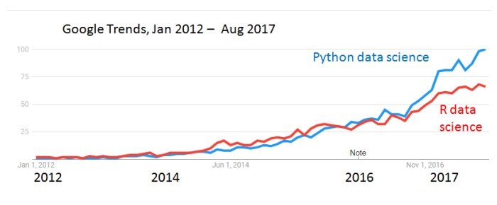
(Source: KDnuggets; https://www.kdnuggets.com/2017/09/python-vs-r-data-science-machine-learning.html)
So it makes sense that Microsoft would eventually implement Python into the Power BI platform, and we need not wait any longer. It’s here! As of August 2018, you can now incorporate Python visuals in your Power BI projects.
What Makes Python So Great?
As a data analyst who has spent quite a bit of time cleaning, transforming, analyzing, and visualizing data in Python, not to mention conducting some machine learning experiments, one of the things I love about Python is its clear, readable syntax. This makes it easier to learn and progress; even the less-technical have a better chance of understanding what’s going on in the code.
Another thing I love about Python is the Pandas library. Pandas allows you to work with dataframes and streamlines the data manipulation and analysis process.
Lastly, the ability to produce beautiful looking charts with relatively few code is high on my list. Matplotlib and Seaborn (which is based on Matplotlib) are two libraries that can be utilized to develop professional looking charts with very little code. When you’re just exploring the data for insights and not too concerned with formatting, a single line of code is usually all it takes.
There’s certainly more great things about Python but I think you get the point. Let’s get on to the demos!
Setting Up Python
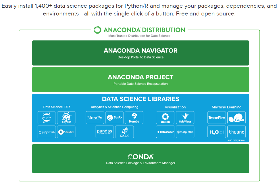
There are two prerequisites you will have to ensure are in place before you can start working with Python in Power BI. The first is to ensure that you already have Python installed on your computer. There’s different approaches to doing this; however, I recommend installing the Anaconda Distribution (choosing the latest version of Python). With this single download you pretty much get everything you’ll need for data analysis in Python.
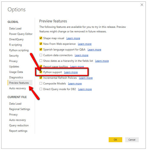
Since Python is currently a “preview feature” in Power BI, the second prerequisite is ensuring that you have Python support checked in the preview features section of Power BI Desktop. Within the Power BI Desktop, go to File > Options and settings > Options.
Python Visuals in Power BI
Now that you have Python installed and enabled, you need to click on the Python visual icon under Visualizations.
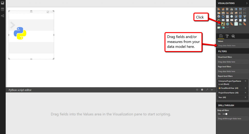
The data you place in the Values area will automatically be converted into a dataframe – essentially a table or 2-dimensional data structure with columns and rows. The gray area at the bottom, where it says “Python script editor,” is where you’ll write or copy/paste your Python script/code. Once you’re done writing your script, or if you want to test your script, click on the “Run script” icon.
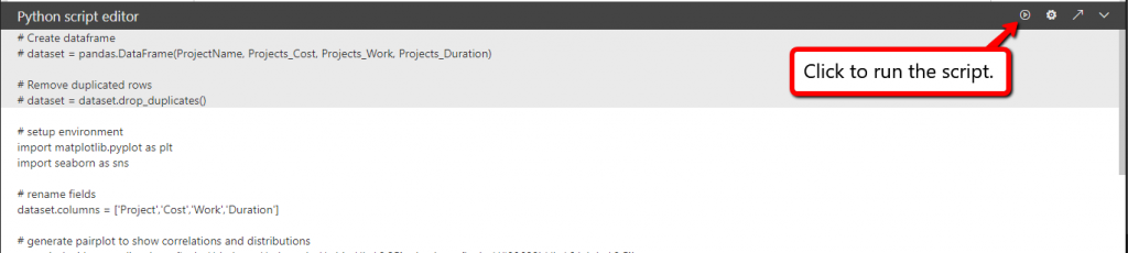
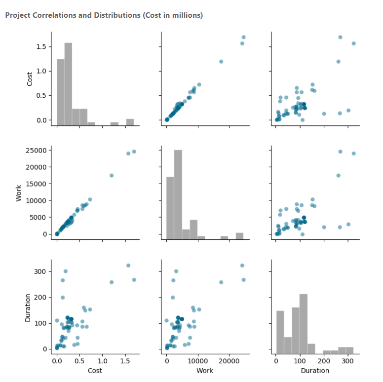
Following are three data visualizations developed with Python in Power BI, along with the code used. Don’t worry if you don’t understand what’s going on in the code. The point here is not to teach you Python but to demonstrate how you can use Python visuals to produce more advanced reports in Power BI. One of the things you’ll notice is that it doesn’t take much code to produce these visuals. These are just three examples of virtually endless opportunities for visualizations. The first visual uses the Seaborn library, which is a popular data visualization library built on Matplotlib. I used the seaborn.pairplot() function to create a pairplot of project cost, work, and duration. The scatterplots show the correlations between the variables. Since a variable perfectly correlates with itself, a histogram is used across the diagonal, allowing you to see the distribution of that variable.
Python Code:
# setup environment
import matplotlib.pyplot as plt
import seaborn as sns

# rename fields
dataset.columns = ['Project','Cost','Work','Duration']

# generate pairplot to show correlations and distributions
sns.pairplot(dataset, diag_kws={'color':'darkgray','edgecolor':'white','lw':0.25},
             plot_kws={'color':'#00688b','lw':0,'alpha':0.5})

# adjust plot
plt.tight_layout()

# show plot
plt.show()
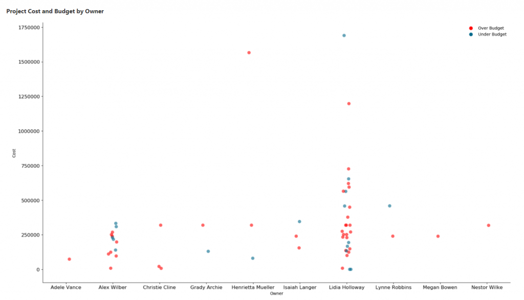
This next plot is known as a dotplot or a stripplot. This uses Seaborn’s stripplot() function. It shows the distribution of projects by project owner and project cost. It is color formatted based on cost variance. If the cost variance is positive then the project is over budget. If the cost variance is negative then the project is under budget.
Python Code:
# setup environment
import matplotlib.pyplot as plt
import seaborn as sns

# rename fields
dataset.columns = ['Owner','Project','Cost','Cost Variance']

# define hue format
dataset['cv_format'] = dataset['Cost Variance'].apply(lambda x: 'Over Budget' if x > 0 else 'Under Budget')

# plot dotplot/stripplot
sns.stripplot(x='Owner', y='Cost', hue='cv_format', size=8, data=dataset,
              palette=['red','#00688b'], jitter=True, alpha=0.6)
sns.despine()
plt.legend(frameon=False)
plt.tick_params(labelsize=12)

# adjust layout
plt.tight_layout()

# show plot
plt.show()
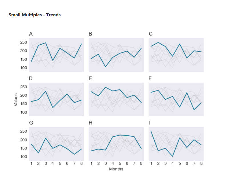
This last example is one of my favorites. I love small multiples. This visual is a little harder to produce, as there is currently no small multiples function. In order to produce this visual, I had to essentially loop through the various categories for each subplot (small plot within the overall plot) and plot their values. This is a great visual for showing comparisons. Showing the other category values grayed-out makes it even easier to see the comparisons.
Python Code:
# setup environment
import matplotlib.pyplot as plt

# set style
plt.style.use('seaborn-dark')

# initiate figure
fig = plt.subplots(3, 3, sharex=True, sharey=True)

# define variables
num = 0
categories = dataset['Category'].unique().tolist()
months = len(dataset['Date'].unique())
min_y = min(dataset['Value']) - 25
max_y = max(dataset['Value']) +25

# loop thru categories and generate plots
for c in categories:
    # increment num by 1 for subplots
    num += 1

    # select subplot to plot on
    plt.subplot(3, 3, num)

    # create axes variables
    x = range(1, months + 1, 1)
    y = dataset['Value'][dataset['Category']==c]

    # plot other categories, grayed out
    for v in categories:
        plt.plot(x, dataset['Value'][dataset['Category']==v], linewidth=0.5, color='gray', alpha=0.3)

    # plot main category
    plt.plot(x, y, color='#00688b', linewidth=1.5, alpha=0.9)
    plt.title(c, loc='left')

    # set y limits and ticks
    plt.ylim(min_y, max_y)
    plt.yticks(range(100, 300, 50))

    # set x ticks
    plt.xticks(range(1, 9,1))

    # only keep ticks on outer subplots
    if num in range(7):
    plt.tick_params(labelbottom='off')
    if num not in [1,4,7]:
    plt.tick_params(labelleft='off')

    # axes titles
    if num == 8:
    plt.xlabel('Months')
    if num == 4:
    plt.ylabel('Values')

# adjust layout
plt.tight_layout()

# show plot
plt.show()
Conclusions
As we have just seen, Python is a powerful tool for data analysis and visualization that can be utilized to extend reporting in Power BI. I certainly don’t expect Python to replace DAX, the Query Editor, or Power BI’s built-in visuals, nor would I want it to. However, I do see it becoming a popular supplement to the Power BI platform. I look forward to seeing how others utilize Python in their own reports. Here at Stratada, we’ll certainly be thinking of ways to use it in our reports and our clients’ reports.
I hope you have found this to be a useful demo of Python in Power BI. Please let us know if there is any way we can help you with your data analytics and reporting needs.