In the world of data analytics, Power BI has emerged as a dominant force, offering users a wide array of features that enable seamless data visualization and interpretation. One of the most powerful aspects of Power BI is the ability to create custom visuals that can be tailored to specific needs. In this post, we will be diving into the Stratada Timeline custom visual for Power BI, a powerful tool for showcasing events and milestones in a visually appealing and easy-to-understand manner.
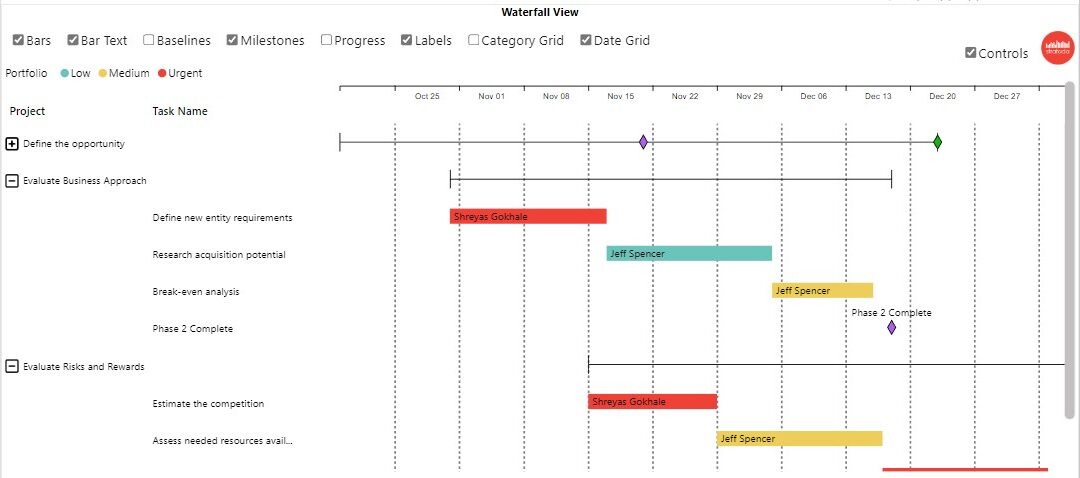
What is the Stratada Timeline Custom Visual?
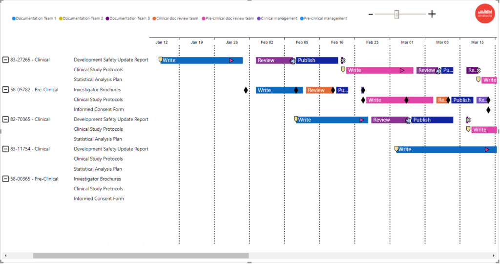
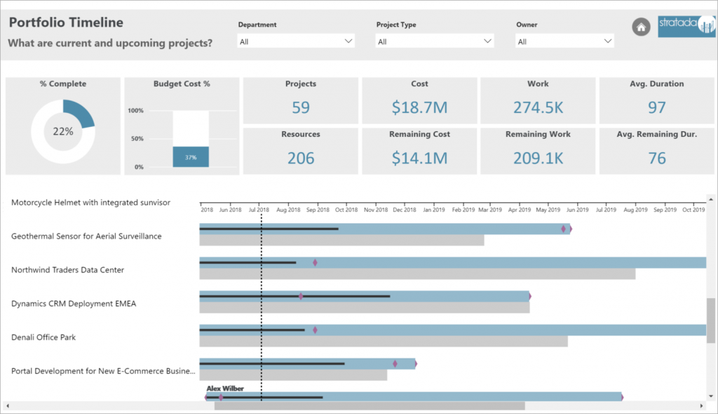
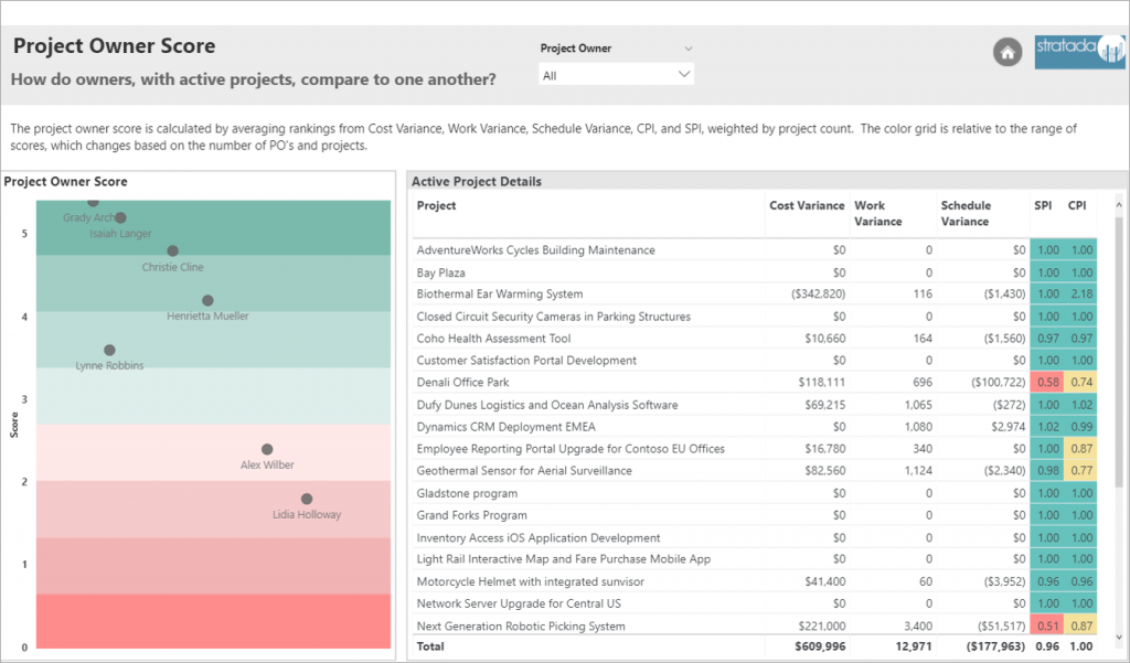
The Stratada Timeline custom visual is a versatile, interactive tool that allows users to display events or milestones across a timeline in Power BI. This custom visual enables users to view data over time, making it easier to identify patterns, trends, or anomalies. With the Stratada Timeline, users can create a visually appealing and interactive representation of their data, providing valuable insights and facilitating data-driven decision making.

- Customizable Appearance: The Stratada Timeline custom visual offers several options for customization, including color schemes, line styles, and icon shapes. Users can easily tailor the appearance of their timeline to match their brand, project, or presentation theme.
- Interactive Data Exploration: This custom visual allows users to interact with the timeline by hovering over elements, revealing additional information about each event. This feature not only enhances user engagement but also provides an efficient way to explore the data and gain deeper insights.
- Granular Time Scales: The Stratada Timeline custom visual supports various time scales, ranging from years to seconds. This flexibility enables users to display events at different granularities, depending on their specific needs.
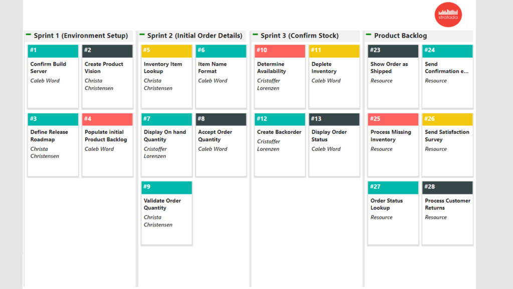
- Data Grouping and Filtering: Users can group events into categories and apply filters to narrow down the scope of their analysis. This feature is particularly useful when working with large datasets, as it allows for a more focused view of the data.
- Integration with Other Power BI Features: The Stratada Timeline custom visual seamlessly integrates with other Power BI features, such as slicers and report pages. This integration enables users to create a cohesive and interactive dashboard that offers a comprehensive view of their data.
Use Cases for the Stratada Timeline Custom Visual

The Stratada Timeline custom visual is suitable for a wide range of applications across various industries. Here are a few examples of its potential use cases:
- Project Management: Display project milestones and deadlines, helping teams track progress and identify potential bottlenecks.
- Marketing Campaign Analysis: Visualize the timeline of marketing campaigns and events, allowing marketers to analyze the success of each initiative and make data-driven decisions.
- Incident Analysis: Showcase incidents or issues in a chronological order, facilitating identification of trends or patterns that might require further investigation.
- Historical Analysis: Display significant historical events to provide context for academic research or educational purposes.
The Stratada Timeline custom visual for Power BI is a powerful tool that offers users an interactive and visually appealing way to explore data over time. With its customizable appearance, granular time scales, and seamless integration with other Power BI features, the Stratada Timeline is a valuable addition to any Power BI dashboard.