At Stratada we are always looking for ways to highlight Power BI’s data science and data analysis capabilities. The ability to use Python in Power BI is one of our favorite methods for deeper analysis. We decided to use easily available COVID-19 data and write up our steps to share in this post.
COVID-19 has become a global public health emergency, having grown even bigger than the SARS outbreak which occurred a few years ago. The virus emerged in Wuhan (China) in December 2019. As of 18th June 2020, more than eight million people worldwide have been tested positive and a total of 450,000 deaths have been recorded.
We believe that all data has a story to tell. This pandemic is spreading all over the world and it has become important to understand about this spread. This article is an effort to analyze the cumulative data of confirmed cases, deaths, and recovered cases over time using Python and Power BI. Along with this, we will also take a look at some of the worst affected states in USA.
Python integration has been available in Power BI for some time. It’s possible to run Python scripts directly in Power Bi Desktop and import the resulting datasets into a Power BI Desktop data model. We will be using the CSSE COVID-19 dataset present in this GitHub repository. The folder csse_covid_19_time_series contains time series data in csv files for confirmed cases, deaths and recoveries starting from 22nd January, 2020. The dataset is updated daily to account for the increase or decrease in the cases on that day. Also, https://ourworldindata.org/coronavirus-source-data contains testing data for all the countries. Both of these are open sourced datasets and can be used for any purpose.
This article is divided into following topics:
1. Setting up Python in Power BI
2. Creating the data import script
3. Create visuals using Python
Setting up Python in Power BI
Installing python and required packages :
To run Python scripts in Power BI Desktop, you need to install Python on your local machine. You can download Python from the Python website. This article uses the following Python packages –
- Pandas – for data manipulation and analysis
- Matplotlib – for plotting and visualization
- Numpy – For array manipulation
In a console or shell, use the pip command-line tool to install these packages. For example to install pandas, run pip install pandas in command prompt.
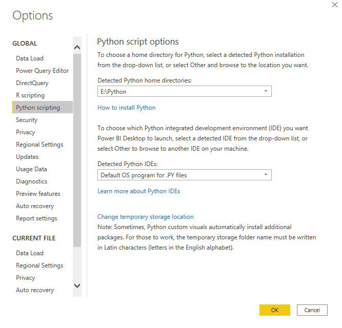
Configure Power BI to use Python :
- Start Power BI and click on File located at top left hand corner. Click on Options and Settings and then on Options.
- Click on Python Scripting to open the Python script options. As default Power BI lists the Python environments it has been able to detect in the system. You can specify a path of any other python environment as well.
Create Data Import Script
-
- Go to the Home tab and click Get data and choose More
- Select the Python script option from the list and click Connect. A Python script dialog opens where you can add your own code.
- In the next window we can choose which datasets to import.
Create visuals using Python
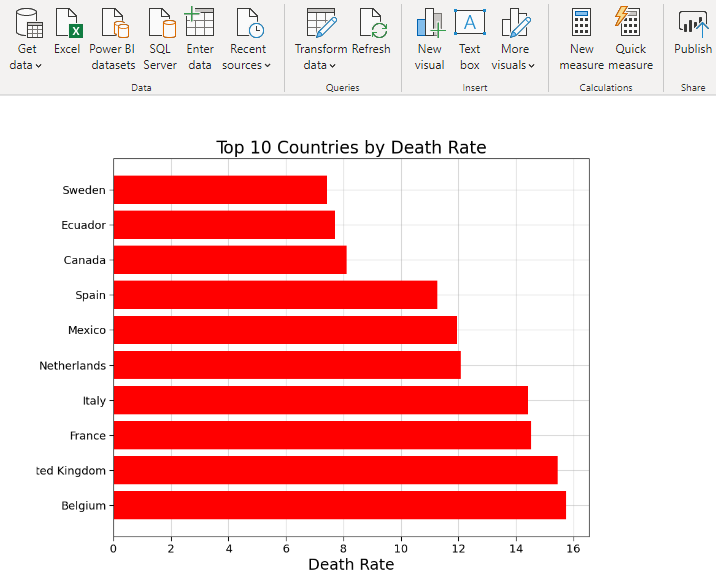
1. Top 10 Countries (Death Rate)
The Death Rate is the ratio of number of people who died due to COVID-19 to number of people who tested positive. This is dependent on healthcare facilities available in the country and immunity of the people. In our calculations, we have taken into account the countries having more than 50,000 cases. Although United States has maximum number of deaths and cases, it currently stands 16th in the world with respect to death rate. In the figure below, the death rate is shown in terms of percentage.
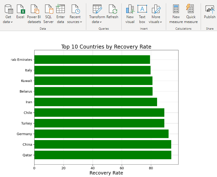
2. Top 10 Countries (Recovery Rate)
The Recovery Rate is the ratio of number of people who have recovered from COVID-19 to number of people who tested positive. Same as death rate, healthcare facilities and immunity of the people in the country play a major role. In the figure below, the recovery rate is in percentage.
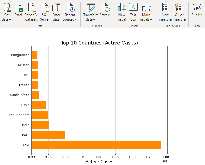
3. Top 10 Countries (Active Cases)
Subtracting the number of deaths and recoveries from the infected patients, we get number of active cases in a country. Fewer the active cases lesser is the chance of further spreading the disease.
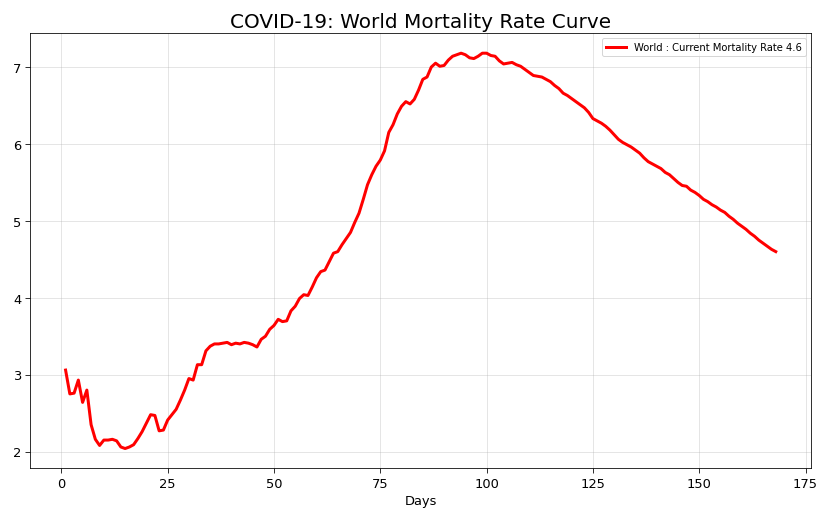
4. World Mortality Rate Curve
Mortality Rate is the number of deaths during a specific interval of time. The figure below shows the variation of Mortality Rate from January 2020 to present. It is represented in terms of number of deaths per 100 infected people.
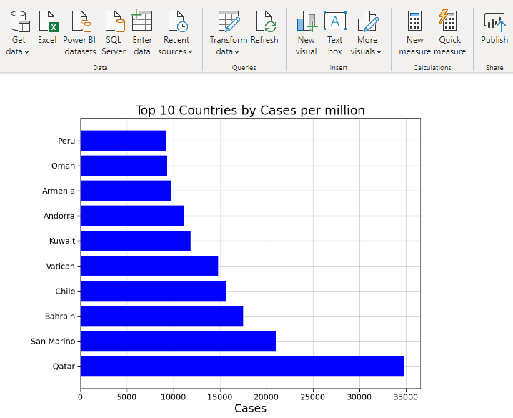
5. Top 10 Countries (Cases Per Million)
The total population of a country should be taken into consideration while determining the spread of this virus. The countries having a small population can test rapidly and curb the spread in a short time. The graph below shows the number of infected people per million.
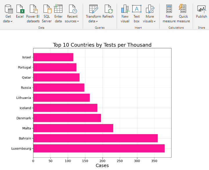
6. Top 10 Countries (Tests per Thousand)
One of the most important measure to curb the spread of the virus is to do more testing. The more you test, the more quickly you can quarantine the infected people. The graph below shows the number of people tested per 1000 population. In Bahrain almost one third of it’s population is tested till now. This means that countries with small population can curb the spread more quickly than others.
Analyzing COVID-19 Spread in United States
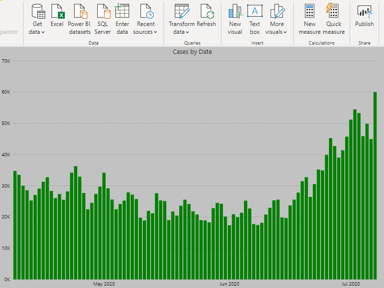
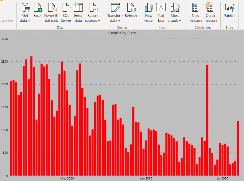
1. Daily Cases and Daily Deaths
As of this article’s publish date, United States of America has recorded almost 3 million cases and over 100,000 people have died. Although the number of daily cases and deaths had fallen in the beginning of June, new hot spots have developed in the past few days due to easing of the restrictions. The graphs below show the number of cases and deaths recorded per day in the past 3 months.
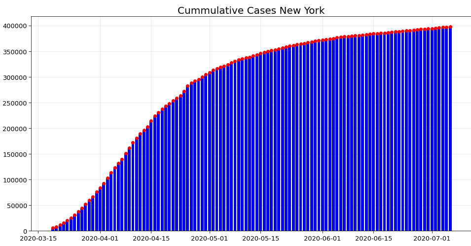
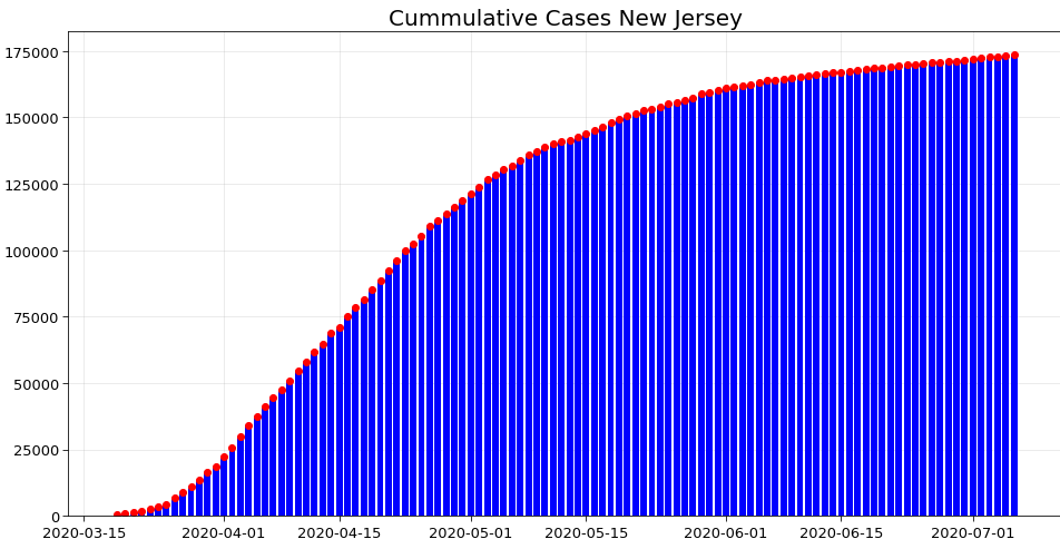
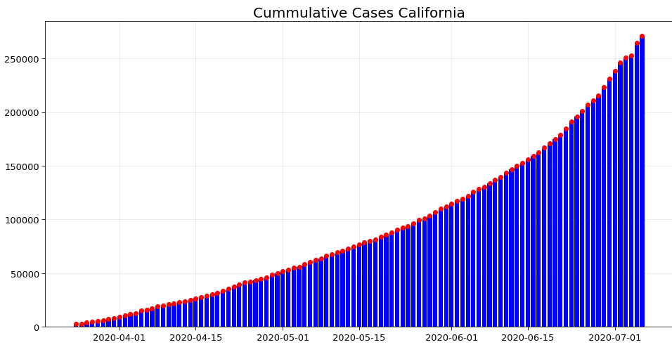
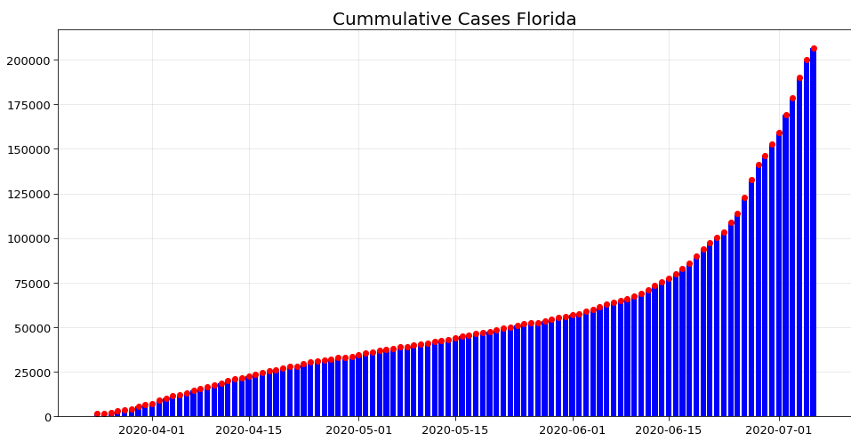
2. Analyzing the curve in 4 states – New York, New Jersey, California, Florida
Initially, New York and New Jersey were affected the most due to high population density. However, the curve has almost flattened in both of these states. It means that the spread is largely brought under control. This can be seen in the following graphs.
However in the past few days, California and Florida have become the new hotspots. This can be seen from their respective curve of cumulative cases. Hence even now precautions need to be taken to prevent the spread in other states.
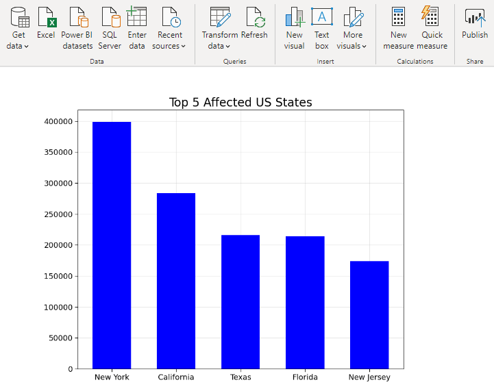
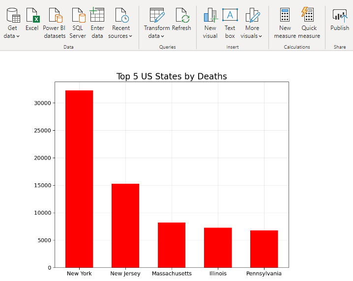
3. Top 5 States in USA (Number of Cases and Number of Deaths)
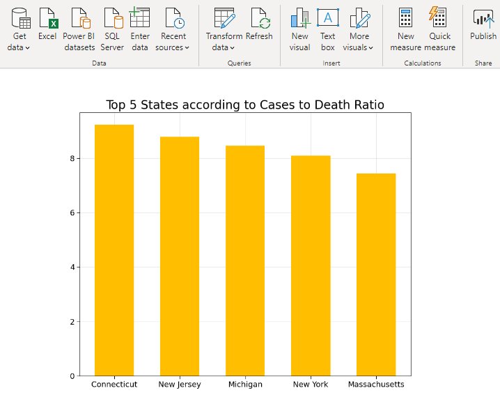
4. Top 5 States in USA (Cases to Death Ratio)
This is the ratio of number of positive cases to number of deaths in a state. In the figure below, the ratio is represented in terms of percentage on the Y-axis. For example – In Connecticut out of 100 who tested positive about 9 died.
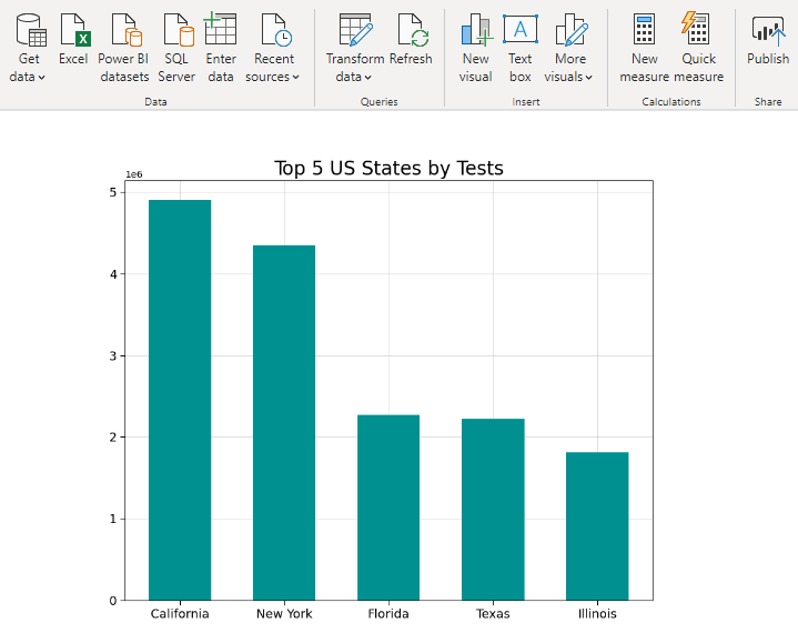
5. Top 5 States in USA (By Tests Performed)
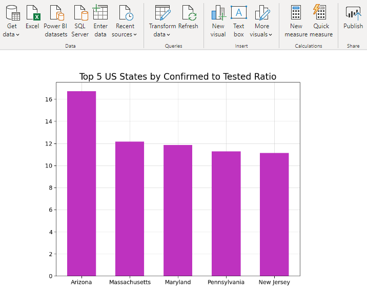
6. Top 5 States in USA (By Confirmed Cases to Total Tested Ratio)
A higher Confirmed Cases to Total Tested Ratio indicates that a state is able to identify potential hot spots. If correct steps are taken, this will help in curbing the spread of the disease quickly. The figure below shows that in Arizona about 17 out of 100 people tested are positive.
This article shows the use of Python for Data Analysis and Visualization in Power BI. Whatever data you have, Stratada Data Scientists can help you interpret it using the latest techniques and the best tools.